The following infographic provides a concise view of individual property details across various UK cities. Simply selecting a blue map marker will reveal the area’s average house price and expected rental yields, allowing you to compare and contrast at the click of a button.
Also revealed is the number of sales in the previous year, current average asking prices and current average rental prices and yields– a big help for property investors seeking their next purchase. Over 100 areas are listed, from Truro in Cornwall, all the way up to Lerwick in the Shetland Islands.
 Bloom Towers | Dubai
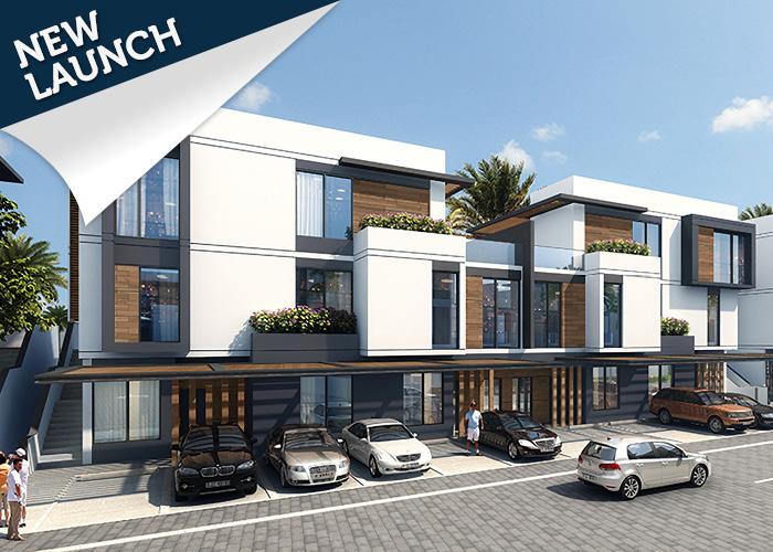 Park Lane | Dubai
 Jumeirah Luxury | Dubai
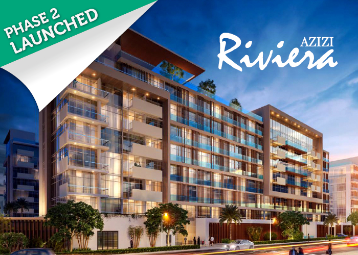 Azizi Riviera | Dubai
 Bloom Heights | Dubai